I created the Design language system and used that for designing the UI of mobile app and web platform. I worked as a lead UX designer and designed the UX for more than 100+ screens for Mobile and Web platform
Key Objectives of the project
Coherent design across all the platforms
Better alignment and faster delivery
Seamless Customer Experience

Project Overview Video

These are the areas where I played a vital role in the overall project. My strong skill-set in research and designing always helps me to analyze things more efficiently and allows me to come up with innovative ideas for solving the problems of the users and my team. I was working on this project with 3 other designers who were specialized in UI/UX.

Scrum workflow incorporated with double-diamond process
In order to create this overview, I took the Scrum methodology, the Double Diamond model, our methods, and our ever-expanding tools apart, and mapped them out in a single reference.
The planning- Our team comes together to allocate points to user stories prioritized by the Product Owner.
Development- This is where the team works on completing said user stories, which are usually tracked using a Kanban board (to do, doing, ready for review, done).
Learn- This is we test the designs with the stakeholders and internal team and iterate the designs, these obstacles are used to refine or create new user stories.
Review- This is where we come together to reflect on how the sprint went and which parts of working together you would like to improve. I motivate my teams to also include knowledge sharing here.
Main Highlights
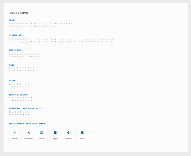
1. Design Language System Directory
Guidelines, rules, and design elements to help designers create a coherent and systematic design, properly support the project, and establish seamless communication with developers.
2. Mobile app & web platform UI/UX
Created 100+ screens for mobile app and web platforms by following UX laws and the latest Ui trends. Also delivered working prototypes and high res vector illustrations.
Define and discover phase
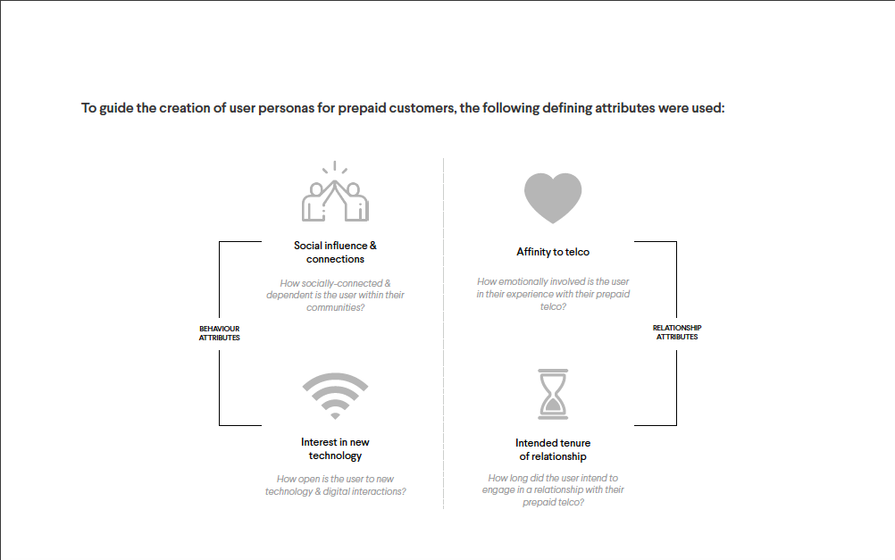

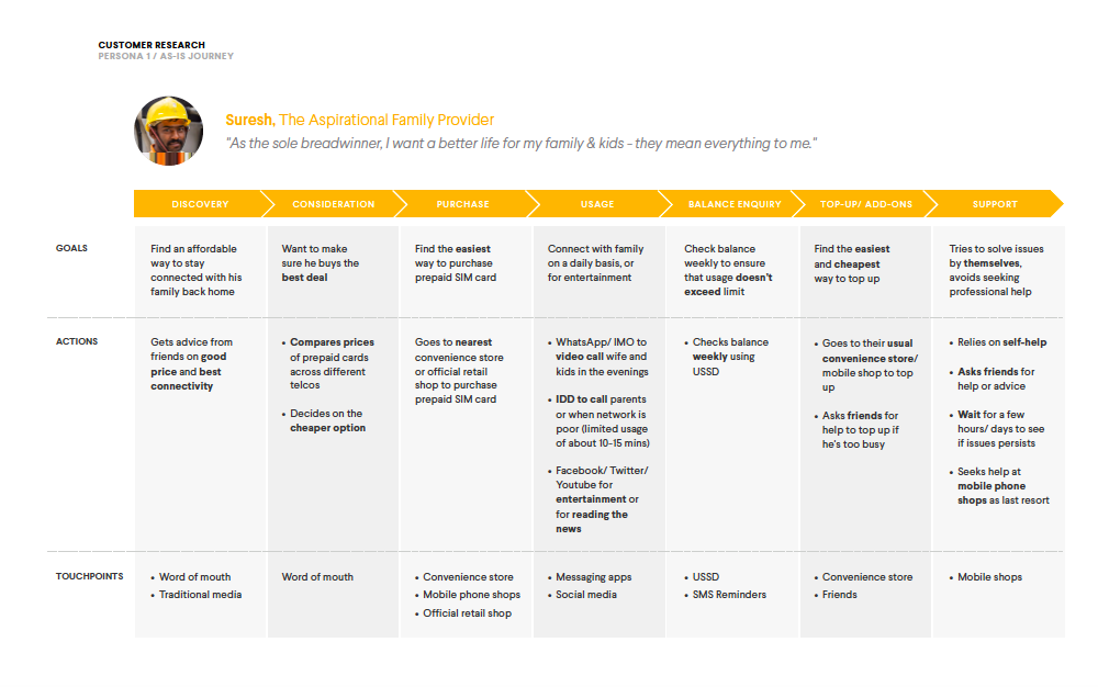


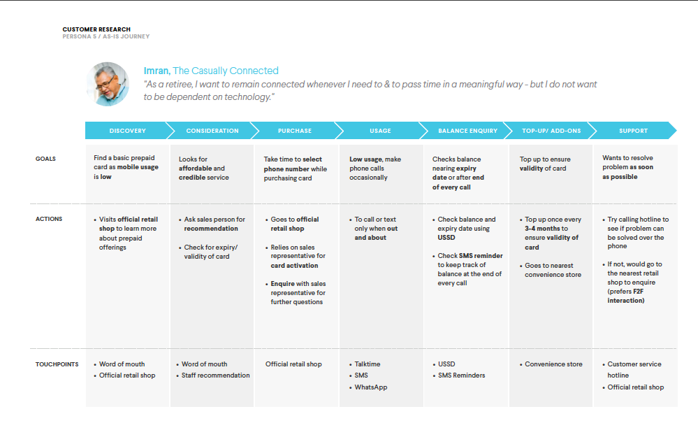

I conducted 2 user interviews out of 20 to empathize with the users and collaborated with the research team. Most of the participants were foreign workers, tourists, and locals who shared insights about their experience with prepaid services.
Brand Experience & Relationship- To understand the type of prepaid brand experience that resonates well with potential prepaid customers, as well as their perception of their current telco.
As-is Customer Journey- To understand prepaid customers’ as-is journey, especially the peak, the pain points, the transition, and the pit experiences.
Digital Journey Possibilities- To explore the potentials of digitalizing the future telco journey and ways to make it a more engaging experience for customers.

Research and Analysis (synthesis)
After digging deeper into the market and brand I identified the main opportunity areas and the design approach we should select to move forward in the project

Trend forecasting and analysis
Often times we forget to check what’s new in the industry and just keep focusing on the usual workflow. It is important to examine each and every aspect and for doing that we should stay updated with the industry standards. I closely checked all the apps that are following humanistic and minimal approaches and creating solutions for a huge customer base.

User stories and scope estimation
I collaborate with the team for the discussion on the user stories and to give the estimation on the efforts required for designing it. After that, we got the defined tasks in the form of different sprints. This phase was really important for initial alignment and also for brainstorming before getting hands dirty on mockups and wireframes.

Card sorting with the team
I organized several cards sorting activities within the design team and also with the other stakeholders. It helped us a lot in creating the IA for the website and mobile app. I was also responsible for the general walkthrough for everyone who was new to the Figma board and building up the overall templates for this activity.

1.Design Language System Directory
Process & Objective

Introduction to Design language system
After finishing up all the primary, secondary research, user flow diagrams, wireframes, and low-poli prototypes we were all set to start working on Ui designs and the development of the customer mobile app, web portal, and internal dashboard for handling the large customer base.
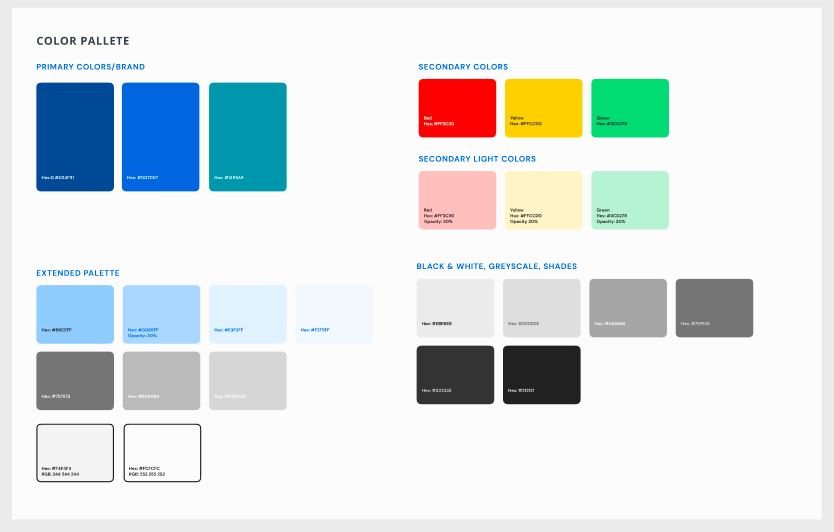
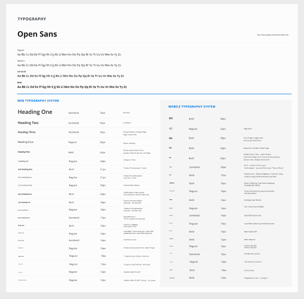
It is important to have a design language system when you are working on multiple platforms and different teams will be going to perform design and development-related tasks.
My previous experience and the lessons I learned in past projects helped me to suggest the higher management about the VDLS. With the help of VDLS, we can make a coherent design across all the platforms and finish the whole project with lesser iterations.
Tools used:
Figma- We made all the reusable components on Figma and followed the same for designing the final screens. It helped to finish the design task with lightning-fast speed.
Zeroheights- With the help of this tool we created an online library-like material Ui through which developers pick code very easily and white-label it on other screens by just changing the master CSS. (link for the Zerohieghts library- https://zeroheight.com/619df3849/p/60df03-introduction)
Zeplin- Its easy integration with the Figma app helped us a lot in exporting the code quickly and efficiently for the developers.
Adobe illustrator- With the help of adobe illustrator we managed to create beautiful designs and export SVG on the Zeroheights.


-

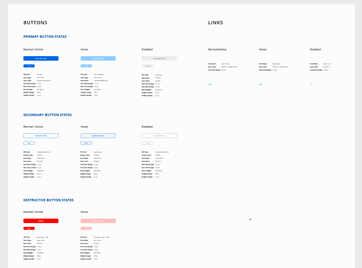
Variants
Creating variants helped us to create working prototypes with ease and showed all working aspects properly to the developers that leads to coherent design. Here we showed, initial, hover, focus, and disabled state for toggles using the variants feature on Figma.
-

Components
We followed the Atomic and molecular approach for building a design language system where we used component making a feature of Figma and created multiple reusable buttons, cards and templates. It not only helped us ship our design work quickly but also helped all the designers to maintain the same level of coherency on all the screens and developers also used the same components during developing web and app platforms.

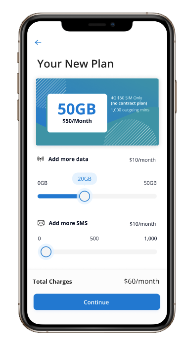
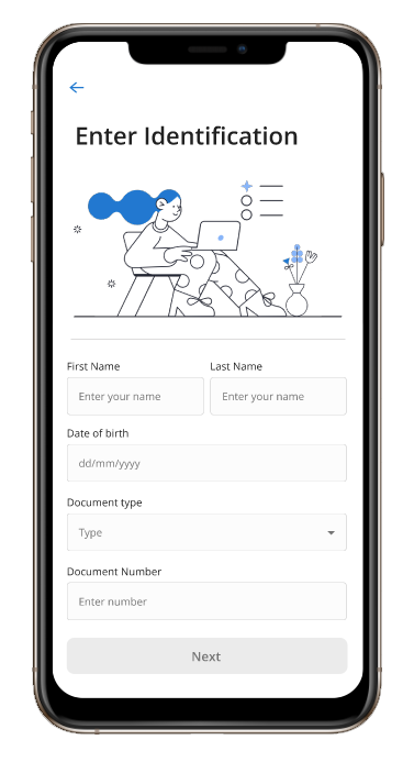
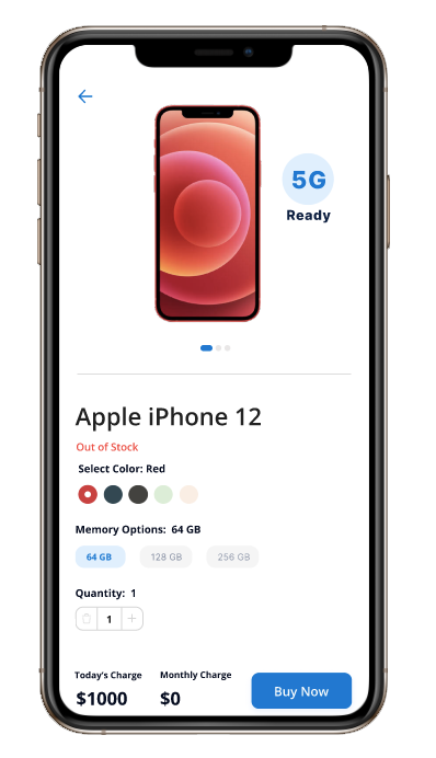
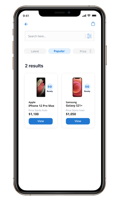
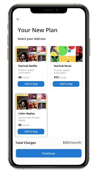
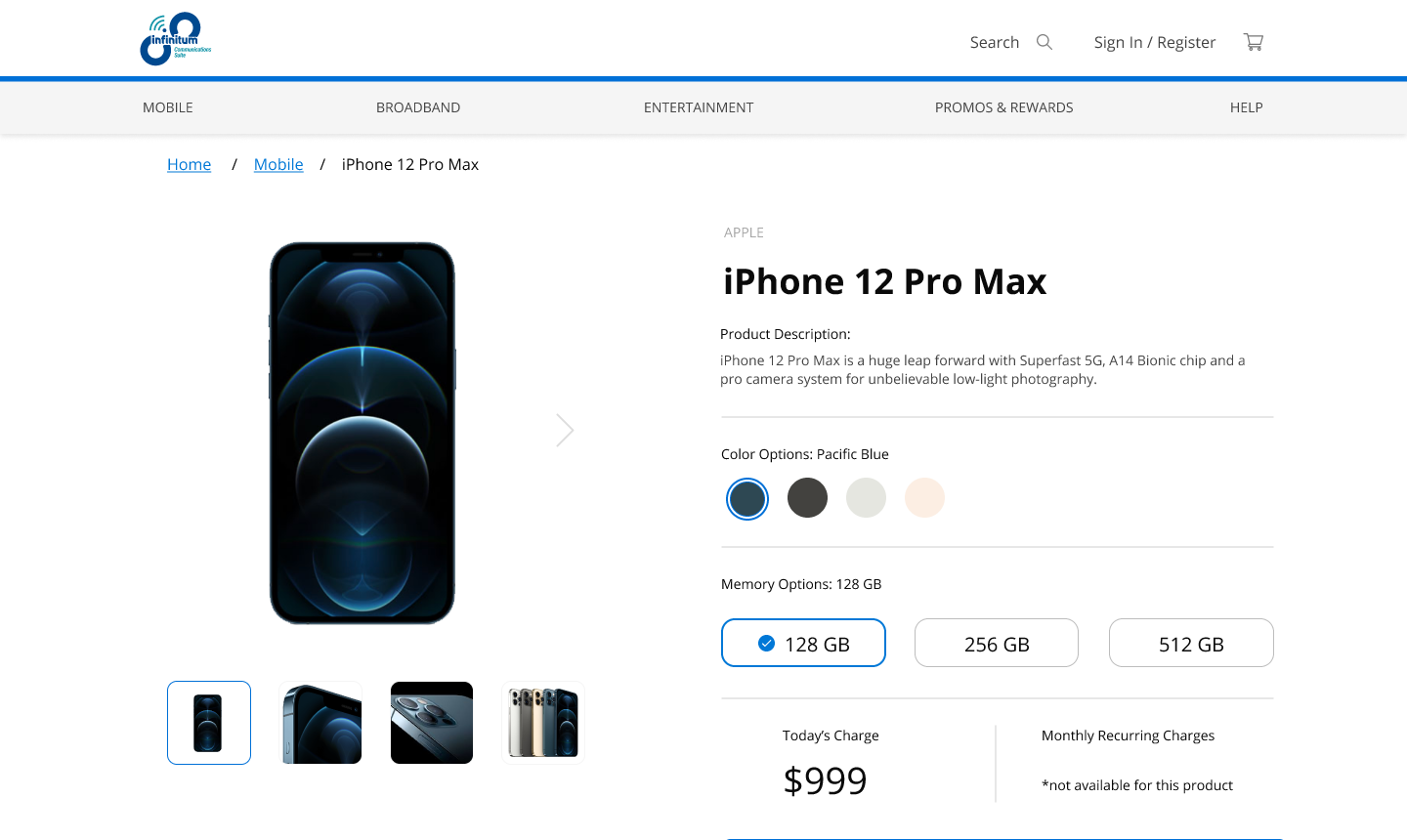
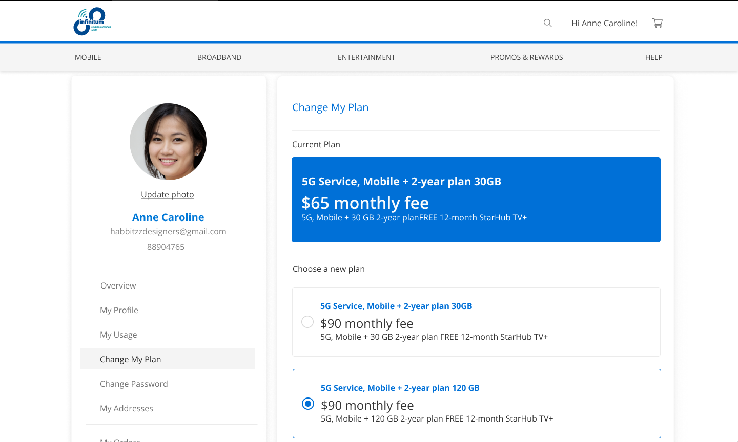
We created screens for customer web portals and mobile apps, I led the Ux and maintained the visual coherency on both platforms.
We worked on more than100+ screens and delivered the project with the estimated time and sometime before the deadline.
VDLS played a vital role in designing a quick and clean Ui.
Figma link: https://www.figma.com/file/o8dcdJtBgg3JoZ9cHQPJGz/Project-ICS?node-id=0%3A1